全国服务热线:400-777-6907
全国服务热线:400-777-6907
Clean up your way of communicating by using Six Sigma DMAIC. The main issue with people not being heard is they aren’t communicating in an effective and concise way. Ever notice that when someone is passionate about a topic, their tone is different? That’s because they are well-versed on the subject matter.
请使用六西格玛的DMAIC来整顿沟通方式。人们没有被聆听的主要问题是:他们并没有以有效和简洁的方式进行沟通。你是否曾经注意过,当某个人关注某一个话题的时间,语气是不是不同的?那是因为他们对该话题很熟悉。
When discussing topics socially, why not make a mental roadmap of what you want to convey using the DMAIC template? Now remember, this doesn’t mean sitting there without saying anything because you’re trying to figure out how to use each phase.
在社交场合讨论话题时,为何不使用DMAIC的模板制作一个你想要传达的智慧路线图呢?请记住:这并不意味着你只是坐在那里默不作声,因为,你需要搞清楚在每个阶段如何使用。
The subject matter could run the gamut, from animal welfare to political solutions for the state of the economy. The subject matter doesn’t matter — what matters is your comprehension on the subject and your solutions or opinions about it and why.
从动物福利到经济状况的政治解决方案,这一主题可以涵盖诸多方面。事实上,主题并不重要-重要的是对主题的理解、解决方案者或意见,以及原因。
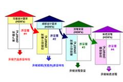
Here’s a little overview of the DMAIC template:
以下是对DMAIC模板的回顾:
Define Phase: Define the subject matter and how it affects others in the process of living life. State how fixing this subject matter would improve the quality of life for others. Collect data (it helps if you’ve read articles on the subject matter)。
定义阶段:定义主题,以及其在生活的过程中如何影响到他人。陈述如何解决这一问题,会提高他人的生活质量。收集数据(如果你读过有关该主题的文章,那将很有帮助)。
Another great tool is the Pareto chart. The Pareto chart was created by Vilfredo Pareto, an Italian economist. The Pareto principle, named after him, is the concept that 20% of input accounts for 80% of output.
帕累托图,是另一个很不错的工具。帕累托图,是由意大利经济学家维尔弗雷多?帕累托所创建的。帕累托原理,以维尔弗雷多?帕累托的名字而命名,理念是:20%的输入,占据了80%的输出。
Input = time, resources, effort.
输入=时间、资源、精力
Output = results, rewards, revenue.
输出=结果、奖励、收入?
The Pareto chart can apply to anything.
帕累托图,适用于任何领域。
Measure Phase: Absolutely any data that you have at your fingertips. A quick Google search can help find any Value Stream Map or Cause and Effect Diagram. For example, these could be depicted as Nielsen ratings or graphs on what you are discussing.
测量阶段:当然是手头上的数据。用谷歌快速搜索,就可以帮助我们找到价值流图或者因果图。比如,这些正在讨论的内容都可以被描述为尼尔森收视率,或者图表。
Analyze Phase: Using the tools on the Define Phase and Measure Phase, validate your point. Remember, data and analytics don’t lie, they are numbers that validate the current state of the subject matter.
分析阶段:使用定义阶段和测量阶段的工具,去验证你的观点。要记住,数据和分析是验证主题当前状态的数字,它们是不会说谎的。
Improve Phase: State the best potential solutions that you have found, and again validate your point and why these solutions would work. Show the data you’ve found. You could even hypothesize a scenario.
改进阶段:陈述发现的最佳潜在方案,之后,再次验证观点,以及这些方案为何管用。将找到的数据展示出来。甚至,我们可以假设某个场景。
Control Phase: Show or tell how you would sustain your new hypothesized solution. Even if you don’t have the actual true data, a well thought out hypothesis based on existing truth of the subject matter will prove your point.
控制阶段:展示或者说出如何维持新假设方案。即使没有真实的数据,但是基于主题真实性的经过深思熟虑的假设,也是可以证明你的观点的。
In many creative industries or startups, the data that is available is what exists on subjects surrounding the project but not on the actual product or service since it was just invented.
在诸多创意产业或者初创企业当中,可用的数据是围绕该项目的数据,而不是刚刚创造出来的实际的产品或者服务的数据。
上一篇:为什么要参加六西格玛绿带培训?

全国服务热线:
400-777-6907
天行健企业管理顾问有限公司 全国服务热线:400-777-6907
邮箱:zyg@leanchina.cn 网址:www.lxgmgl.com

关注天行健微信
既获取更多信息
版权所有@深圳市天行健企业管理顾问有限公司 粤ICP备13011693号